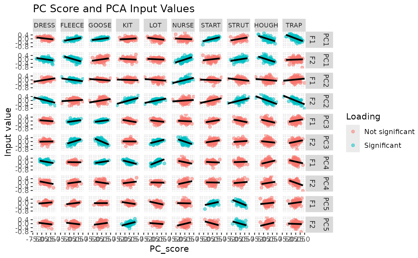
It is sometimes useful to see the relationship between PCs and the raw values
of the input data fed into PCA. This function takes the results of running
pca_test, the scores for each speaker from the pca object, and the raw data
fed into the PCA analysis. In the usual model-to-pca analysis pipeline, the
resulting plot depicts by-speaker random intercepts for each vowel and an
indication of which variables are significantly loaded onto the PCs. It
allows the researcher to visualise the strength of the relationship between
intercepts and PC scores.

