Model-to-PCA workflow
Joshua Wilson Black, Lynn Clark
Source:vignettes/articles/Model-to-PCA-workflow.Rmd
Model-to-PCA-workflow.Rmd1 Overview
The primary purpose of this package is to aid the ‘model-to-PCA’ pipeline used in a series of projects at NZILBB (Brand et al. 2021; Hurring et al. Under review; wilsonblackUsingPrincipalComponent2023?; Wilson Black et al. 2023).
This article briefly sets out the pipeline and shows how to use the functions in the package. It was part of a workshop delivered as part of a workshop for the Voices of Regional Australia project.
We’ll look at a quick introduction to PCA, before applying the workflow to some data from the UC QuakeBox project.
This material slightly expands on (wilsonblackUsingPrincipalComponent2023?). For almost all purposes, it would be better to cite that article than this page.
1.1 Why care about co-variation?
A few reasons:
Traditionally, sociolinguistic studies focused on analyzing individual sounds separately, even when considering multiple sounds, except in specific cases like vowel shifts (e.g, gordonInvestigatingChainShifts2013?; hayTrackingWordFrequency2015a?) where there is an expected relationship between the variables for structural reasons.
But, work in third-wave sociolinguistics suggests that sounds may function as interconnected systems e.g. stylistic variation involves combining collections of variants to convey social meaning (beckerLinguisticRepertoireEthnic2014?; podesvaPhonationTypeStylistic2007?).
This has been tricky to investigate empirically and most work in this paradigm has explored correlations between two variables.
More recently, we’ve seen a shift towards thinking about clusters of co-varying variables using methods like Principal Component Analysis (PCA) (Brand et al. 2021).
1.2 Packages
We use the following R packages. Comments are provided in the code block below to indicate their function in the workflow.
Note that there is no special package we use to apply PCA. We use the
function prcomp(), which is built in to R.
library(tidyverse) # We use functions from most of the 'tidyverse'
# packages so we tend to load them all at once with library(tidyverse).
# The best introduction to tidyverse style is "R for Data Science":
# https://r4ds.hadley.nz/

# ggrepel provides a version of `geom_label` which
# automatically repels labels away from other plot
# items.
library(ggrepel)
# We use ggcorrplot to generate correlation plots before applying pca.
library(ggcorrplot)

library(mgcv) # mgcv is required to fit GAMMs.
library(itsadug) # itsadug is used to extract predictions and random effects
# from GAMMs
library(broom) # we use `broom` from the `tidymodels` collection to generate
# dataframes with summary information from our models.

# `this package`nzilbb.vowels` (not yet released on CRAN) contains functions to
# perform Lobanov 2.0 normalisation and apply and visualise PCA. Install it from
# github, with, e.g. remotes::install_github('JoshuaWilsonBlack/nzilbb_vowels').
# This may require you to install the 'remotes' package.
library(nzilbb.vowels)

# The following line sets the theme for all plots made using the `ggplot2`
# package (part of the tidyverse).
theme_set(theme_bw())
2 What is PCA?
This section is a shortened version of (wilsonblackUsingPrincipalComponent2023?). For further details, see that paper. We especially encourage you to look at the supplementary material available here.
Principal Component Analysis (PCA) is a technique used to simplify complex data sets that contain many variables. It allows us to replace the many variables with a much smaller number of Principal Components (PCs) which capture the majority of the information contained in the original dataset in a convenient way.
Usually, when we have a lot of variables in a dataset, there are correlations between variables. Sometimes this is because there is some real underlying structure in the process which generated the data. For instance, if you look at lots of body measurements from different people, tall people will tend to have longer arms and longer legs than short people. This will lead to a correlation between leg measurements and arm measurements. The resulting pattern in two variables might be captured by a single PC which tracks overall height. Many variables, one underlying pattern.
To explain PCA more fully, and with sociophonetic data, let’s consider data from 100 speakers using first formant readings from three vowel sounds: ‘trap,’ ‘dress,’ and ‘kit.’ Changes in the pronunciation of these vowels over time are linked and so by using this as example, we can see how PCA finds patterns and we can link those back to our understanding of the data.
We are going to see how PCA can reduce these three variables down to two variables. Three variables is not a lot of variables. The advantage of looking at three variables is that we can visualise the entire process.
The following code generates the data set we need taking data from ONZE, which
comes via the nzilbb.vowels package.
# `onze_vowels` comes from the `nzilbb_vowels` package.
onze_sub <- onze_vowels |>
  filter(
    vowel %in% c("DRESS", "KIT", "TRAP")
  ) |>
  select(
    speaker, vowel, F1_50, yob, gender
  ) |>
  # We take means of the first formant data and keep track of each speaker's
  # year of birth and gender.
  group_by(
    speaker, vowel
  ) |>
  summarise(
    F1_50 = mean(F1_50),
    yob = first(yob),
    gender = first(gender)
  ) |>
  ungroup()

# We pivot the dataframe 'wider' so it has a column for each of our three
# vowel types.
onze_wide <- onze_sub |>
  pivot_wider(
    names_from = vowel,
    values_from = F1_50
  )
What does the data look like at this stage of the process?
onze_wide |>
  slice_head(n=10)
#> # A tibble: 10 × 6
#> speaker yob gender DRESS KIT TRAP
#> <fct> <int> <fct> <dbl> <dbl> <dbl>
#> 1 CC_f_020 1936 F 623. 647. 638.
#> 2 CC_f_084 1959 F 551. 622. 669.
#> 3 CC_f_170 1975 F 535. 589. 630.
#> 4 CC_f_186 1956 F 456. 525. 579.
#> 5 CC_f_210 1973 F 516. 568. 624.
#> 6 CC_f_215 1950 F 558. 635. 658.
#> 7 CC_f_245 1977 F 605. 664. 662.
#> 8 CC_f_258 1974 F 418. 496. 486.
#> 9 CC_f_285 1974 F 472. 450. 532.
#> 10 CC_f_429 1947 F 508. 632. 668.We have an anonymous speaker identifier, a year of birth variable, gender, and a numerical variable for each of dress, kit, and trap.
Let’s visualise the vowel readings in a scatter plot, using colour for one of the dimensions.
initial_plot <- onze_wide |>
  ggplot(
    aes(
      x = DRESS,
      y = TRAP,
      colour = KIT
    )
  ) +
  geom_point() +
  labs(
    x = "DRESS (Hz)",
    y = "TRAP (Hz)",
    colour = "KIT (Hz)"
  )

initial_plot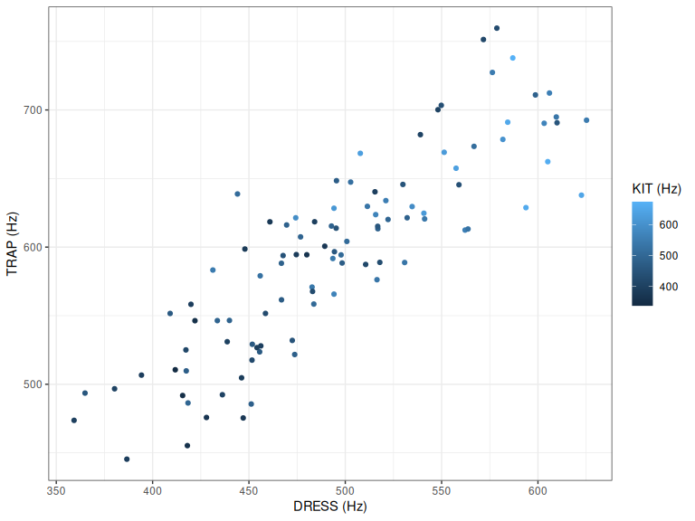
Figure 2.1: Mean first formant values for three NZE monophthongs.
In Figure 2.1, the most obvious thing to note is that dress and kit are strongly correlated with one another. A second observation is that the overall colour of the points in the bottom left seems darker than in the top right. This suggests that kit’s first formant values are also correlated with the values for trap and kit.
This observation is not surprising. Formant frequencies are associated with vocal track length. We are here interested in seeing how PCA can capture this obvious association and, we will see, can also show a more linguistically interesting pattern in the data.
The code block below applies PCA and extracts some important information for our initial explanation. We will explain how to actually apply PCA in detail later.
onze_pca <- prcomp(
  # Select the numeric columns of the data
  x = onze_wide |> select(DRESS, KIT, TRAP),
  scale = FALSE # NB: this should usually be TRUE.
)

onze_wide <- onze_wide |>
  mutate(
    PC1 = onze_pca$x[, 1],
    PC2 = onze_pca$x[, 2]
  )

# Extract centre of the point cloud.
pca_centre <- onze_pca$center

centre_data <- tibble(
  "DRESS" = pca_centre[["DRESS"]],
  "KIT" = pca_centre[["KIT"]],
  "TRAP" = pca_centre[["TRAP"]]
)

# Extract loadings.
pca_loadings <- as_tibble(onze_pca$rotation, rownames = "vowel")

# Use the loadings and centre to find where each point sits along PC1 and PC2
# when represented in the original 3D space.
onze_wide <- onze_wide |>
  mutate(
    PC1_DRESS = (PC1 * pca_loadings[[1, "PC1"]]) + pca_centre[["DRESS"]],
    PC1_KIT = (PC1 * pca_loadings[[2, "PC1"]]) + pca_centre[["KIT"]],
    PC1_TRAP = (PC1 * pca_loadings[[3, "PC1"]]) + pca_centre[["TRAP"]],
    PC2_DRESS = (PC2 * pca_loadings[[1, "PC2"]]) + pca_centre[["DRESS"]],
    PC2_KIT = (PC2 * pca_loadings[[2, "PC2"]]) + pca_centre[["KIT"]],
    PC2_TRAP = (PC2 * pca_loadings[[3, "PC2"]]) + pca_centre[["TRAP"]],
  )
PCA starts by finding the ‘centre’ of the data. This is just the point at the mean value of each variable. It can be useful to think of the data as a ‘cloud’ of points. In Figure 2.1 we depict this cloud using both spatial position and colour.
centre_plot <- initial_plot +
  geom_point(data = centre_data, size = 15, shape = 4, stroke = 3) +
  labs(
    x = "DRESS (Hz)",
    y = "TRAP (Hz)",
    colour = "KIT (Hz)"
  )

centre_plot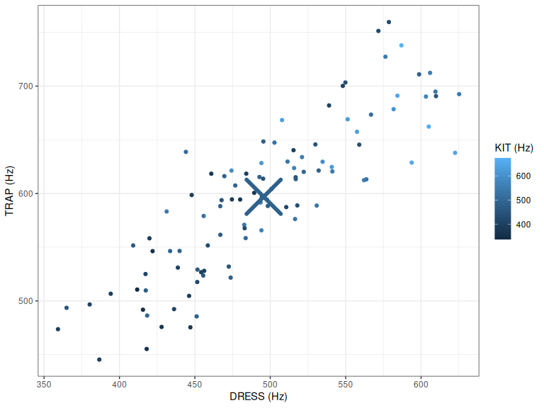
Figure 2.2: DRESS, TRAP, and KIT F1 with centre of point cloud indicated.
Figure 2.2 has a large ‘X’ indicating the centre point, or mean value, for each variable. It is obviously in the middle of the \(x\) and \(y\) axes. If you look at the shade of blue, with the help of the colour scale, you’ll see that the mean value of kit is somewhere around \(500%\).
We now draw a line passing through the centre which ‘maximises variance’. This is the line which stays in the cloud for the longest. This is the first principal component (PC). What does it look like in our small example?
# This block does some more behind-the-scenes work.
PC1_projections <-  onze_wide |>
  select(
    speaker, PC1_DRESS, PC1_TRAP, PC1_KIT
  ) |>
  rename(
    DRESS = PC1_DRESS,
    TRAP = PC1_TRAP,
    KIT = PC1_KIT
  )

PC2_projections <-  onze_wide |>
  select(
    speaker, PC2_DRESS, PC2_TRAP, PC2_KIT
  ) |>
  rename(
    DRESS = PC2_DRESS,
    TRAP = PC2_TRAP,
    KIT = PC2_KIT
  )

pc1_plot <- centre_plot +
  geom_line(
    aes(
      x = DRESS,
      y = TRAP,
      colour = KIT
    ),
    linewidth = 2,
    data = PC1_projections
  )

pc1_plot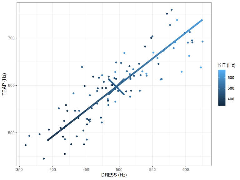
Figure 2.3: PC1 on top of centre and points.
Figure 2.3 shows this line. It is clear that it passes through dress and trap the ‘longest’ way. It is harder to see this for kit, but spend a few moments convincing yourself that this is true.
As expected, given what we said above about vocal tract length, this PC corresponds to overall difference in size. At one end of the line, we see low values for dress, kit, and trap; at the other end, we see high values for the same variables.
After drawing the first PC, we draw a second. The second PC also passes through the centre and maximises variance, but it also has to be at right angles to the first PC.
We visualise this now (removing the centre point, to make the plot a little more readable).
pc2_plot <- initial_plot +
  geom_line(
    aes(
      x = DRESS,
      y = TRAP,
      colour = KIT
    ),
    linewidth = 2,
    data = PC1_projections
  ) +
  geom_line(
    aes(
      x = DRESS,
      y = TRAP,
      colour = KIT
    ),
    linewidth = 1.5,
    data = PC2_projections
  )

pc2_plot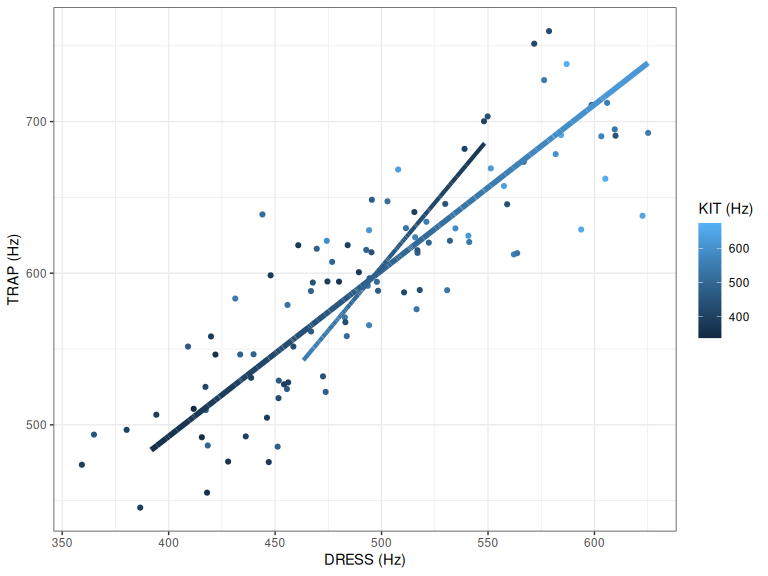
Figure 2.4: PC1 and PC2.
The slightly thinner line in Figure 2.4 represents PC2. If we look at the end of the line at the bottom left, we see high values for kit, and lower values for dress and trap. At the other end we see lower values for kit, and higher values for dress and trap.
What does this PC mean? Speakers at one end of PC2 have lower (in the vowel space) realisations of kit and higher realisations of dress and trap. That is, they are more innovative with respect to the New Zealand English short front vowel shift. So PC2 is picking up a linguistically interesting pattern.
A third PC could be drawn at this point, but in practice we never go to as many PCs as we have original variables.
Often, PCA is used to produce visualisations of complex datasets in two dimensions. When this is done, we use PC1 and PC2 as the axes on our plot, and plot each point with respect to their PC scores. Scores are the values given to each speaker for each PC. If a speaker has completely average production, then they will have PC scores of \(0\) for each PC.
What does this look like for the current example?
ind_plot <- onze_wide |>
  ggplot(
    aes(
      # WARNING: We scale these values as a rough and ready way to get the
      # scores on the same scale as the loadings. The methods we will use in the
      # real examples below won't have this problem. The upshot: don't just copy
      # the code in this block in a real research project!
      x = scale(PC1),
      y = scale(PC2)
    )
  ) +
  geom_hline(yintercept = 0, linetype="dashed") +
  geom_vline(xintercept = 0, linetype="dashed") +
  geom_point() +
  coord_fixed() +
  labs(
    x = "PC1",
    y = "PC2"
  )

ind_plot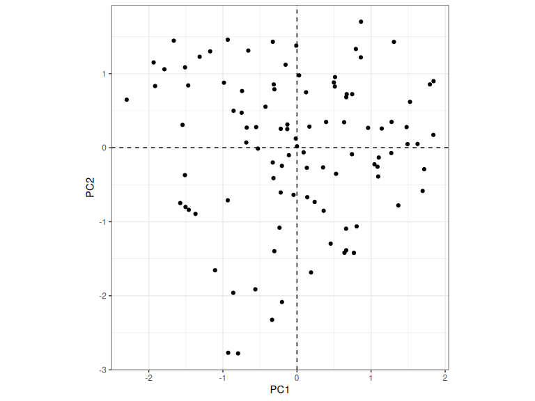
Figure 2.5: Plot of PC1 and PC2 scores for each speaker.
There’s one further issue to consider. We know that PC1 captures overall increase and decrease in formant values, but does a high PC1 score mean the formant values increase or decrease? When we drew the PC1 and PC2 lines, we didn’t have to decide on a direction. For instance, in Figure 2.4, we haven’t decided whether PC1 scores increase when we move from the centre point to the left of the plot along the PC1 line or whether they decrease. Either option is fine and which ever PCA function you use in R will make a choice for you.
One useful way to connect the interpretation of the PCs with the plot of the scores is to make a ‘biplot’. It’s ‘bi’ in the sense that it plots both the speakers and the original variables. This is what it looks like in our case:
bi_plot <- ind_plot +
  geom_segment(
    aes(
      x = 0,
      y = 0,
      xend = PC1,
      yend = PC2
    ),
    data = pca_loadings,
    colour = "blue",
    linewidth = 1,
    arrow = arrow(length = unit(3, "mm"))
  ) +
  geom_label(
    aes(
      x = PC1,
      y = PC2,
      label = vowel
    ),
    data = pca_loadings,
    size = 3,
    colour = "blue",
    nudge_x = -0.35
  )

bi_plot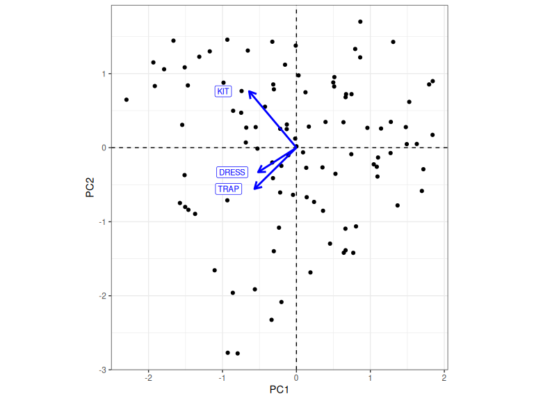
Figure 2.6: Plot of PC1 and PC2 scores with loadings for each variable.
Figure 2.6 shows the loadings of the original variable for PC1 and PC2. It is important to keep the terminology of scores and loadings clear in your mind. Loadings relate the original variables to the PCs, while scores relate the individual data points, in our case speakers, to the PCs.
How do you read Figure 2.6? The arrows show which way the original variables move as we move around the plot. If we go in the direction of an arrow, then that variable is increasing in value. So, for instance, if we start in the centre and move to the right, along PC1, the values for our original variables increase. That is, a more negative PC1 score means an across the board decrease in formant values. In the case of PC2, if we go up from the centre, then kit increases in value, but dress and trap decrease in value. That is, higher PC2 scores correspond to a more innovative position in the NZE short front vowel shift.1
In Figure 2.6 we have achieved a representation of speakers in terms of two variables with a clear linguistic meaning: overall vocal tract length and position in the NZE short front vowel shift. When we started, in Figure 2.1, we had three variables, all of which contained formant values. The great advantage of PCA is that it we can often achieve this in much more complex data sets.
One final point is worth highlighting: interpretation is often helped by adding
additional variables to a plot. In this case, we have a yob variable.
Presumably, if our interpretation of PC2 is right, we’d expect speakers born
earlier to be on the conservative side of PC2 (i.e., to have a lower PC2 score).
Let’s see if that’s right:
biplot_sup <- onze_wide |>
  ggplot(
    aes(
      # WARNING: We scale these values as a rough and ready way to get the
      # scores on the same scale as the loadings. The methods we will use in the
      # real examples below won't have this problem. The upshot: don't just copy
      # the code in this block in a real research project!
      x = scale(PC1),
      y = scale(PC2),
      colour = yob
    )
  ) +
  geom_hline(yintercept = 0, linetype="dashed") +
  geom_vline(xintercept = 0, linetype="dashed") +
  geom_point() +
  geom_segment(
    aes(
      x = 0,
      y = 0,
      xend = PC1,
      yend = PC2
    ),
    data = pca_loadings,
    colour = "blue",
    linewidth = 1,
    arrow = arrow(length = unit(3, "mm"))
  ) +
  geom_label(
    aes(
      x = PC1,
      y = PC2,
      label = vowel
    ),
    data = pca_loadings,
    size = 3,
    colour = "blue",
    nudge_x = -0.35
  ) +
  scale_colour_continuous(type="viridis", option="plasma") +
  coord_fixed() +
  labs(
    x = "PC1",
    y = "PC2",
    colour = "Year of birth"
  )

biplot_sup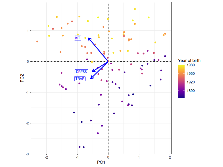
Figure 2.7: Plot of PC1 and PC2 scores with loadings for each variable. Colour indicates year of birth.
Figure 2.7 is exactly what we expect. Low PC2 values correspond to speakers who were born earlier. The older speakers are the more conservative. Other questions are raised by the plot (why does the cloud of points taper off towards the bottom left, for instance?), but we will leave these for your own reflection.
3 Quakebox monophthongs
We now move to an example of real research use of PCA from the QuakeBox corpus. This section follows in the footsteps of Hurring et al. (Under review).
The anonymised data, with stopwords removed,2 is available in the
data directory. If you have opened the RStudio project, you should have no
difficulty running the following block.3
QB1 <- read_rds('data/QB1_anon.rds')3.1 Preprocessing and filtering
The dataframe we have just loaded has already removed words with hesitations, tokens without transcribed words and unimportant speaker demographics (such as their household location, occupation, areas lived, etc.). The remainder of this section shows what additional steps we took to preprocess and filter our data. You may have other preferences!
3.1.1 Tidying
First of all, let’s change the DISC notation for vowels to Wells Lexical Set labels (we just find this easier to understand when examining the outputs):
QB1 <- QB1 |>
    mutate(
      Vowel = fct_recode(
        factor(VowelDISC),
        FLEECE = "i",
        KIT = "I",
        DRESS = "E",
        TRAP = "{",
        START = "#",
        LOT = "Q",
        THOUGHT = "$",
        NURSE = "3",
        STRUT = "V",
        FOOT = "U",
        GOOSE = "u"
    )
  )
Next, we generate a vowel duration column which we will use for filtering later.
QB1 <- QB1 |>
  mutate(
    VowelEnd = as.numeric(VowelEnd),
    VowelStart = as.numeric(VowelStart),
    VowelDur = VowelEnd - VowelStart
  )
We modify the Ethnicity column so that we get a binary distinction between
Māori and non-Māori. The code here is messy, as it is capturing quite a few
different cases. We also change the gender codes from lower case to upper case
(e.g. ‘m’ -> ‘M’) for compatibility with earlier projects.
QB1$Ethnicity[QB1$Ethnicity == "NZ mixed ethnicity"] <- "Maori"
QB1$Ethnicity[QB1$Ethnicity == "NZ Maori"] <- "Maori"
QB1$Ethnicity[QB1$Ethnicity == "na"] <- "Non-Maori"
QB1$Ethnicity[QB1$Ethnicity == "Other"] <- "Non-Maori"
QB1$Ethnicity[QB1$Ethnicity == "NZ European"] <- "Non-Maori"


# For convenience, we also change gender coding from 'f', 'm' -> 'F', 'M'.
QB1 <- QB1 |>
  mutate(
    Gender = str_to_upper(Gender)
  )
Finally, we change some character vectors to factors. The only reason we do
this is that it is necessary for the mgcv package, which we use to fit
GAMMs.
# and we make sure that factor variables are coded as factors (rather than character vectors).
factor_vars <- c(
  "Gender", "Ethnicity", "stress"
)

QB1 <- QB1 |>
  mutate(
    across(all_of(factor_vars), as.factor),
    Age = as.ordered(Age)
  )
3.1.2 Filtering
We now remove tokens which are, or are likely to be, errors introduced by forced alignment and formant tracking.
First, we remove tokens:
- which have infeasibly short or long duration,
- have first formant values of 1100 Hz or greater,
- missing speaker metadata, and
- missing formant values.
QB1 <- QB1 |>
  filter(
    between(VowelDur, 0.01, 2), #filter tokens with very short or long vowel
    # durations (we take values between 0.01 and 2 seconds)
    F1_50 < 1100, # Remove all tokens with F1 at or above 1100hz.
    !is.na(Gender), #filter speakers with missing gender
    !Gender == "",
    !is.na(Age), # Filter speakers with missing age.
    Age != 'na', # Filter speakers with missing age.
    !is.na(F1_50), # Filter missing formant values.
    !is.na(F2_50)
  )
We then remove unstressed tokens and those which precede liquids.
QB1 <- QB1 |>
  filter(
    stress != "0"
  ) |>
  mutate(
    following_segment_category = fct_collapse(
      as_factor(following_segment),
      labial = c('m', 'p', 'b', 'f', 'w'),
      velar = c('k', 'g', 'N'),
      liquid = c('r', 'l'),
      other_level = "other"
    )
  ) |>
  filter(
    !following_segment_category == 'liquid'
  )
We then remove tokens with formant values more than 2.5 sd from their speaker’s mean. The code below defines a function to apply a standard deviation filter. This is perhaps slightly more complication that the usual R workflow in linguistics, but I leave it in so you can see the consequence (if any) of changing this cut off value.
sd_filter <- function(in_data, sd_limit = 2.5) {
  vowels_all_summary <- in_data |>
    # Remove tokens at +/- sd limit (default 2.5 sd)
    group_by(Speaker, Vowel) |>
    summarise(
      #calculate the summary statistics required for the outlier removal.
      n = n(),
      mean_F1 = mean(F1_50, na.rm = TRUE),
      mean_F2 = mean(F2_50, na.rm = TRUE),
      sd_F1 = sd(F1_50, na.rm = TRUE),
      sd_F2 = sd(F2_50, na.rm = TRUE),
      # Calculate cut off values.
      max_F1 = mean(F1_50) + sd_limit*(sd(F1_50)),
      min_F1 = mean(F1_50) - sd_limit*(sd(F1_50)),
      max_F2 = mean(F2_50) + sd_limit*(sd(F2_50)),
      min_F2 = mean(F2_50) - sd_limit*(sd(F2_50)),
      .groups = "drop_last"
    )

  #this is the main outlier filtering step.
  out_data <- in_data |>
    inner_join(vowels_all_summary, by=join_by(Speaker, Vowel)) |>
    mutate(
      outlier = ifelse(
        F1_50 > min_F1 &
          F1_50 < max_F1 &
          F2_50 > min_F2 &
          F2_50 < max_F2,
        FALSE,
        TRUE
      )
    ) |>
    group_by(Speaker, Vowel) |>
    filter(outlier == FALSE) |>
    ungroup() |>
    select(
      -c(
        outlier, n, mean_F1, mean_F2, sd_F1,
        sd_F2, max_F1, min_F1, max_F2, min_F2,
      )
    )
}

QB1 <- QB1  |>
  sd_filter(sd_limit = 2.5)
In order to match Brand et al. (2021), we remove foot.
QB1 <- QB1 |>
  filter(
    Vowel != "FOOT"
  ) |>
  mutate(
    # Remove FOOT from the factor levels.
    Vowel = droplevels(Vowel)
  )
The final filtering step, again following Brand et al. (2021), is to remove any speakers who have fewer than 5 tokens for any of the remaining vowels. We treat this as a minimum for getting a sensible random intercepts from the speaker. How do we make this judgement? By looking at the health of the models we fit (including the distribution of random intercepts).
low_speakers <- QB1 |>
  # .drop is required to capture situations in which a speaker has NO tokens for
  # a given vowel. It ensures a group for all levels of the vowel factor
  # (including those not present in the data for a given speaker)
  group_by(Speaker, Vowel, .drop = FALSE) |>
  count() |>
  ungroup() |>
  filter(n < 5) |>
  pull(Speaker)

QB1 <- QB1 |>
  ungroup() |>
  filter(!Speaker %in% low_speakers)
3.1.3 Normalisation
We normalise the vowels using the Lobanov 2.0 method. This is Lobanov
normalisation but with a mean of means approach to handle different token counts
across vowel categories.4
Lobanov 2.0 is implemented in the lobanov_2() function in the nzilbb.vowels
package.
3.2 GAMM models
3.2.1 Why?
The pipeline we present here can be called the ‘model to PCA’ pipeline. We will be applying PCA to values extracted from models. To be specific, we apply PCA to random intercepts extracted from GAMM models. These random intercepts represent a measure of how far a speakers production of a vowel varies from what we would expect given the information built into the model.
Why do we do this? Consider PC1 in our toy example of PCA above. Sociophoneticians are not typically interested in the fact that speakers with longer vocal tracts produce lower frequency formants. This is a feature of the voice which we don’t take to be socially meaningful. We get rid of this kind of variation by means of normalisation. But for different projects, there are different kinds of variation which we might want to ignore.
We know, for instance, that older speakers will have distinct production from younger speakers. But, what if, within an age group, some speakers have a more innovative production than others. To get at this with PCA, we need to control for the age of our speakers. We do this by including some measure of age in our models.
Gia Hurring’s PhD thesis (in progress) includes an exploration of the consequences of these modelling decisions for exploring covariation between vowels and consonants, so look out for that.
3.2.2 Fit
This is not the place to provide an explanation of GAMM modelling. Readers are directed to (soskuthyGeneralisedAdditiveMixed2017?).
We fit a distinct GAMM model to each vowel and formant pair i.e., separate models for dress F1, dress F2 etc.
These models predict Lobanov 2.0 normalised formant values with a parametric term for gender and a four-knot smooth for age category at both levels of gender (‘M’ and ‘F’). We also fit articulation rate as a control variable and random effect intercepts for speaker and word.
The pattern in the code block below, of nesting data, fitting models, and extracting intercepts, is set out in more detail by (wilsonblackVisualisingVowelSpace2022?).
Before we begin, we’ll need a numeric representation of the age categories and to convert speaker, gender, and word to factor variables.
# Check that age values in the correct order.
levels(QB1$Age)
#> [1] "18-25" "26-35" "36-45" "46-55" "56-65" "66-75" "76-85" "85+" "na"
# Correct!

# Convert to integer and do to factor conversions for speaker and word.
QB1 <- QB1 |>
  mutate(
    age_category_numeric = as.integer(Age),
    Speaker = as.factor(Speaker),
    Gender = as.factor(Gender),
    Word = as.factor(Word)
  )
We count how many speakers are in each category to check whether any age categories should be excluded:
QB1 |>
  group_by(Age) |>
  summarise(
    speaker_count = n_distinct(Speaker)
  )
#> # A tibble: 8 × 2
#> Age speaker_count
#> <ord> <int>
#> 1 18-25 43
#> 2 26-35 19
#> 3 36-45 50
#> 4 46-55 71
#> 5 56-65 63
#> 6 66-75 36
#> 7 76-85 11
#> 8 85+ 4We’ve only got a few 85+ speakers, so we remove the 85+ category and run the GAMMs. The code block below does this, but can take quite a long time to run. It has be set up so that it does not run unless specifically requested (i.e., by pressing the green ‘run’ button in RStudio).
QB1_models <- QB1 |>
  filter(
    Age != "85+"
  ) |>
  select(
    -F1_50, -F2_50
  ) |>
  pivot_longer(
    cols = F1_lob2:F2_lob2,
    names_to = "formant_type",
    values_to = "formant_value"
  ) |>
  group_by(Vowel, formant_type) |>
  nest() |>
  mutate(
    model = map(
      data,
      ~ bam(
          #main effects
          formant_value ~ Gender +
            s(age_category_numeric, k = 4, by = Gender) +
            # control vars
            s(articulation_rate, k = 3) +
            # random effects
            s(Speaker, bs='re') + s(Word, bs='re'),
          discrete = TRUE,
          nthreads = 4,
          data = .x
      )
    )
  )

# save the models to an external file.
write_rds(QB1_models, here('models', 'QB1models.rds'))
The above models are very large. You may run out of memory. The main reason the models are large is that they have a random intercept for each word. If you remove low frequency words the model will likely fit. This is not a good idea for an actual research project, but could help you follow this workshop!
At this stage of the process, you should check if your models are any good. This falls under the general heading of GAMM modelling. The only thing which you might find difficult is that the models for each vowel are being stored in a dataframe. So, to access the model for dress F1, you could use, e.g.:
dress_f1_model <- QB1_models |>
  filter(
    Vowel == "DRESS",
    formant_type == "F1_lob2"
  ) |>
  pull(model) |>
  pluck(1)

# or, in a more 'base R' style:
dress_f1_model <- QB1_models[
  QB1_models$Vowel == "DRESS" & QB1_models$formant_type == "F1_lob2",
]$model[[1]]
We won’t dwell on this here, as it falls under the general heading of learning how to fit GAMMs. If you are interested, have a look at the kind of model tests we apply here, here, and here.
3.2.3 Plot
While we’re skipping some details of the modelling process, it is absolutely essential that you look at some plots of the predictions from the model. Here we extract predictions from each vowel model for all of our age categories and for both male and female speakers. Here we ignore the question of significance. If you want to see what it looks like to include only statistically significant change over time, see here.
First, we extract the predictions from each model:
to_predict <- list(
  "age_category_numeric" = seq(from=1, to=7, by=1), # All age categories.
  "Gender" = c("M", "F")
)

QB1_preds <- QB1_models |>
  mutate(
    prediction = map(
      model,
      ~ get_predictions(model = .x, cond = to_predict, print.summary = FALSE)
    )
  ) |>
  select(
    Vowel, formant_type, prediction
  ) |>
  unnest(prediction) |>
  # This step is important. It ensures that, when we plot,
  # arrows go from oldest to youngest speakers.
  arrange(
    desc(age_category_numeric)
  )

QB1_preds <- QB1_preds |>
  select( # Remove unneeded variables
    -articulation_rate,
  ) |>
  pivot_wider( # Pivot
    names_from = formant_type,
    values_from = c(fit, CI)
  ) |>
  rename(
    F1_lob2 = fit_F1_lob2,
    F2_lob2 = fit_F2_lob2
  )
We can then plot the predictions we have extracted in the vowel space.
# Tol colours, designed to be colour blind friendly.
vowel_colours <- c(
  DRESS = "#777777", # This is the 'bad data' colour for maps
  FLEECE = "#882E72",
  GOOSE = "#4EB265",
  KIT = "#7BAFDE",
  LOT = "#DC050C",
  TRAP = "#878100", # "#F7F056",
  START = "#1965B0",
  STRUT = "#F4A736",
  THOUGHT = "#72190E",
  NURSE = "#E8601C",
  FOOT = "#5289C7"
)

# add labels to data for plotting purposes
QB1_preds <- QB1_preds |>
    group_by(Vowel, Gender) |>
    mutate(
      vowel_lab = if_else(
        age_category_numeric == max(age_category_numeric),
        Vowel,
        ""
      )
    ) |>
    ungroup()

QB1_preds |>
  ggplot(
    aes(
      x = F2_lob2,
      y = F1_lob2,
      colour = Vowel,
      label = vowel_lab,
      group = Vowel
    )
  ) +
  geom_path(
    arrow = arrow(
        ends = "last",
        type="closed",
        length = unit(2, "mm")
      ),
    linewidth = 1
  ) +
  geom_point(
    data = ~ .x |>
      filter(
        !vowel_lab == ""
      ),
    show.legend = FALSE,
    size = 1.5
  ) +
  geom_label_repel(
    min.segment.length = 0, seed = 42,
    show.legend = FALSE,
    fontface = "bold",
    size = 10 / .pt,
    label.padding = unit(0.2, "lines"),
    alpha = 1,
    max.overlaps = Inf
  ) +
  scale_x_reverse(expand = expansion(mult = 0.2), position = "top") +
  scale_y_reverse(expand = expansion(mult = 0.1), position = "right") +
  scale_colour_manual(values = vowel_colours) +
  facet_grid(
      cols = vars(Gender)
  ) +
  labs(
    x = "F2 (normalised)",
    y = "F1 (normalised)"
  ) +
  theme(
    plot.title = element_text(face="bold"),
    legend.position="none"
  )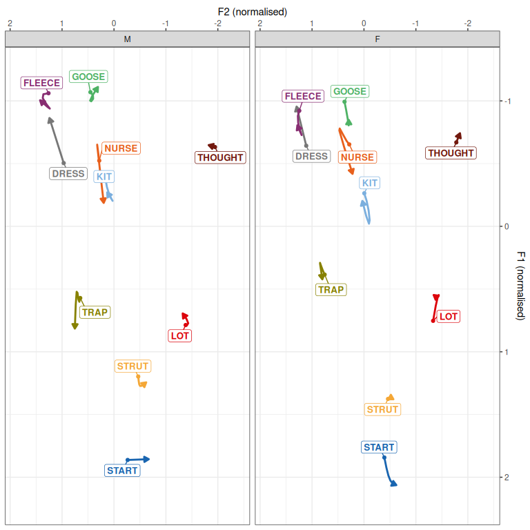
Figure 3.1: Change in realisation of monopthongs over apparent time.
These patterns have caused us a little bit of head scratching. Now is not the place to go into it in detail. place to go into it in detail. From here on, the main thing to know is that the speaker random intercepts in our models provide us with representations of how far individual speakers deviate from these patterns (along with variation in articulation rate) and in which direction.
3.2.4 Extract intercepts
The following code block extracts the random intercepts from each model using
the function get_random() from the itsadug package.
QB1_intercepts <- QB1_models |>
  mutate(
    # for each model we get the speaker random intercepts, rather than the
    # word random intercepts.
    random_intercepts = map(
      model,
      ~ get_random(.x)$`s(Speaker)` |>
        as_tibble(rownames = "Speaker") |>
        rename(intercept = value)
    )
  ) |>
  select(
    Vowel, formant_type, random_intercepts
  ) |>
  unnest(random_intercepts) |>
  arrange(as.character(Vowel)) |>
  ungroup()

head(QB1_intercepts)
We will use the values now stored in QB1_intercepts as input to a PCA
analysis.
Before we switch to PCA, let’s remove the models from memory as they are take up a lot of room.
rm(QB1_models)3.3 PCA
3.3.1 Applying PCA
There are a few options out there for carrying out PCA. We will use the base
R function prcomp(), supplemented by the pca_test() function in the
nzilbb.vowels package.
Both functions require a matrix of numerical variables as input. Each variable should be a column. In our case, we want each vowel-formant pair, e.g. dress F1, nurse F2, etc, to be a column.
This requires us to pivot our random intercepts form long form to wide form. This following code block carries this out.
QB1_intercepts <- QB1_intercepts |>
  # Create a column to store our eventual column names
  mutate(
    # Combine the 'vowel' and 'formant_type' columns as a string.
    vowel_formant = str_c(Vowel, '_', formant_type),
    # Remove '_lob2' for cleaner column names
    vowel_formant = str_replace(vowel_formant, '_lob2', '')
  ) |>
  ungroup() |>
  # Remove old 'vowel' and 'formant_type' columns
  select(-c(Vowel, formant_type)) |>
  # Make data 'wider', by...
  pivot_wider(
    names_from = vowel_formant, # naming columns using 'vowel_formant'...
    values_from = intercept # and values from intercept column
  )

# There's some models with missing values for some speakers. We insist on
# a value for each variable.
QB1_intercepts <- QB1_intercepts |>
  filter(complete.cases(QB1_intercepts))

head(QB1_intercepts)
#> # A tibble: 6 × 21
#> Speaker DRESS_F1 DRESS_F2 FLEECE_F1 FLEECE_F2 GOOSE_F1 GOOSE_F2 KIT_F1
#> <chr> <dbl> <dbl> <dbl> <dbl> <dbl> <dbl> <dbl>
#> 1 QB_NZ_F_103 -0.0976 -0.00990 0.226 -0.171 0.0213 0.0815 0.209
#> 2 QB_NZ_F_107 -0.142 -0.00706 -0.0904 0.0136 0.0969 0.0987 -0.0130
#> 3 QB_NZ_F_121 -0.0537 0.127 0.0717 0.0198 -0.00300 -0.00983 0.0671
#> 4 QB_NZ_F_131 -0.0241 0.0382 0.112 -0.0563 0.0228 -0.0884 0.395
#> 5 QB_NZ_F_132 0.101 -0.0740 -0.0170 0.147 -0.0490 0.0427 -0.0789
#> 6 QB_NZ_F_133 -0.0111 0.0529 -0.136 0.129 0.0659 -0.0688 0.0668
#> # ℹ 13 more variables: KIT_F2 <dbl>, LOT_F1 <dbl>, LOT_F2 <dbl>,
#> # NURSE_F1 <dbl>, NURSE_F2 <dbl>, START_F1 <dbl>, START_F2 <dbl>,
#> # STRUT_F1 <dbl>, STRUT_F2 <dbl>, THOUGHT_F1 <dbl>, THOUGHT_F2 <dbl>,
#> # TRAP_F1 <dbl>, TRAP_F2 <dbl>I like to leave the Speaker column in the dataframe, even though it has to be
removed each time I run PCA. It helps me to remain confident that the values
correspond to specific speakers.5
It’s worth doing a quick sanity check before actually applying PCA. PCA finds patterns of covariation in data. If there are any such patterns, then there should be some pairwise correlations between our variables. We can look at this visually with a correlation plot.
QB1_intercepts |>
  select(-Speaker) |>
  as.matrix() |>
  cor() |>
  ggcorrplot() +
  theme(
    axis.text.x = element_text(size = 8),
    axis.text.y = element_text(size = 8)
  )
#> Warning: `aes_string()` was deprecated in ggplot2 3.0.0.
#> ℹ Please use tidy evaluation idioms with `aes()`.
#> ℹ See also `vignette("ggplot2-in-packages")` for more information.
#> ℹ The deprecated feature was likely used in the ggcorrplot package.
#> Please report the issue at <https://github.com/kassambara/ggcorrplot/issues>.
#> This warning is displayed once per session.
#> Call `lifecycle::last_lifecycle_warnings()` to see where this warning was
#> generated.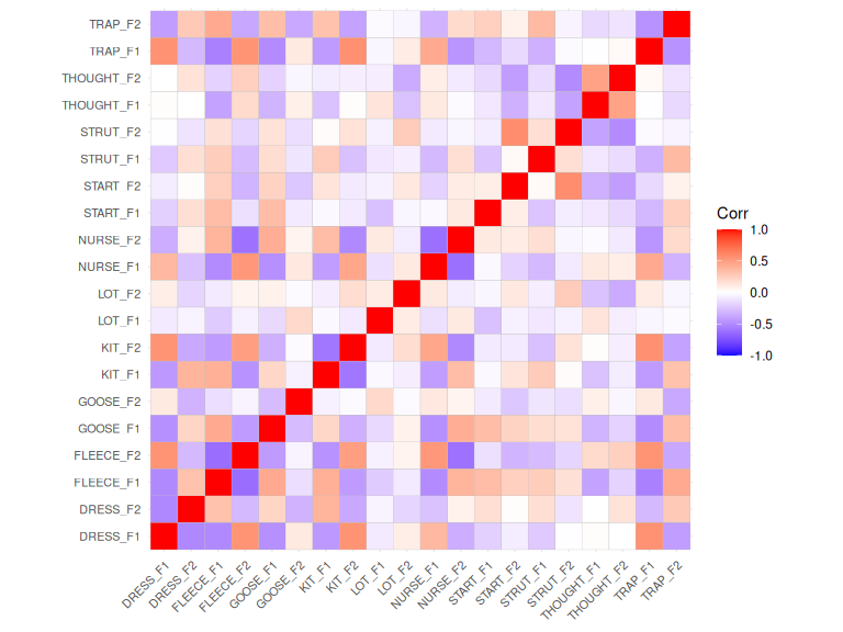
Figure 3.2: Pairwise correlations between extracted random intercepts.
A pattern of various colours, in reasonably deep blue or red is good news at this point of the process.
We test whether the number and magnitude of correlations is significantly
different from what we would see with random data. For instance, by producing
the following plots using the plot_correlation_magnitudes() and
plot_correlation_counts() functions in nzilbb.vowels.
cor_test <- correlation_test(
  QB1_intercepts |>
    select(-Speaker),
  n = 100,
  cor.method = "pearson"
)

plot_correlation_magnitudes(cor_test) +
  labs(title = NULL) +
  plot_correlation_counts(cor_test) +
  labs(title = NULL) +
  plot_annotation(tag_levels = "A")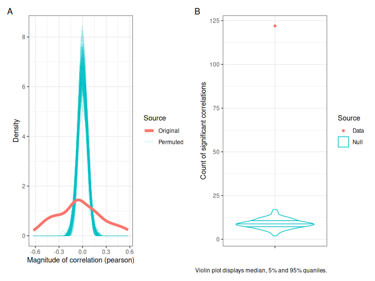
Figure 3.3: Correlation tests applied to the byu-speaker intercepts derived from the QuakeBox models. (A) shows the distribution of correlation magnitudes in the permuted data (teal), and the actual data (red). (B) shows the counts of statistically significant correlations (\(lpha\) = 0.05) in the permuted data (teal) and the actual data (red).
Figure 3.3 shows that there are many more high magnitude correlations in our dataset than in random data (panel A) and that the count of statistically significant pairwise correlations (\(\alpha\) = 0.05) is much higher than found in random data (panel B).
Let’s finally apply PCA using the prcomp() function. It is almost always a
good idea to set scale = TRUE. The default value is only FALSE for
consistency with an earlier programming language (‘S’). Different vowels,
even when normalised, have different variances. If you don’t scale, the
variables with the most variance will dominate even if they don’t appear in any
interesting patterns of covariation.
qb_pca <- prcomp(
  # We use the intercepts without the speaker column.
  QB1_intercepts |> select(-Speaker),
  scale = TRUE
)
What does qb_pca contain, now? Have a look in the RStudio viewer. The key
things to note are qb_pca$x, which contains the speaker scores, and
qb_pca$rotation, which contains the loadings. We also have qb_pca$sdev
which captures how much variation each PC captures and is used to determine
how many PCs we want to use.
Let’s look at the qb_pca$rotation briefly, looking at the loadings for PC1
only.
qb_pca$rotation[, "PC1"]#> DRESS_F1 DRESS_F2 FLEECE_F1 FLEECE_F2 GOOSE_F1 GOOSE_F2
#> 0.30189388 -0.20305569 -0.32250732 0.32900513 -0.27718563 0.09453797
#> KIT_F1 KIT_F2 LOT_F1 LOT_F2 NURSE_F1 NURSE_F2
#> -0.26712816 0.29556390 0.01724038 0.03805744 0.29210571 -0.26058661
#> START_F1 START_F2 STRUT_F1 STRUT_F2 THOUGHT_F1 THOUGHT_F2
#> -0.11924109 -0.13465252 -0.17660130 -0.06213031 0.12018776 0.09017500
#> TRAP_F1 TRAP_F2
#> 0.31817510 -0.25436522Lots of patterns are visible in this output. For instance, the pattern in our toy example above is here. See that dress and trap F1 are loaded positively, while kit F1 has a negative loading. This gives some initial indication that the short front vowel shift is being captured by this PC and perhaps connected with other patterns of covariation. This is explored in detail by Hurring et al. (Under review).
3.3.2 How many PCs?
We have to select a small number of PCs to keep. We are trying to reduce the dimensionality of our original data. We want fewer variables to work with. PCA produces as many PCs as there are variables in the original data, but, when things are working well, most of the information in the data set will be captured in the first few PCs.
We determine how many PCs to keep by looking at how much variance each PC
explains. A useful way to think of this is in terms of the percentage of
variation explained by each PC. We can turn pca$sdev to a proportion of
variance explained and plot it as follows:6
variance_explained <- as_tibble(
  qb_pca$sdev^2 / sum(qb_pca$sdev^2) * 100,
  rownames = "PC"
)

# This bit of code turns the column with PC labels into a factor in the correct
# order, otherwise we get PC1, PC10, PC11, ... PC2...; rather than PC1, PC2,
# PC3... (i.e. alphabetical order rather than numerical)
variance_explained <- variance_explained |>
  mutate(
    PC = factor(
      str_c("PC", PC),
      levels = str_c("PC", 1:nrow(variance_explained))
    )
  )

variance_explained |>
  # We'll just take the first 10 PCs.
  filter(
    PC %in% str_c("PC", 1:10)
  ) |>
  ggplot(
    aes(
      x = PC,
      y = value
    )
  ) +
  geom_col() +
  labs(
    y = "Variance explained (%)"
  )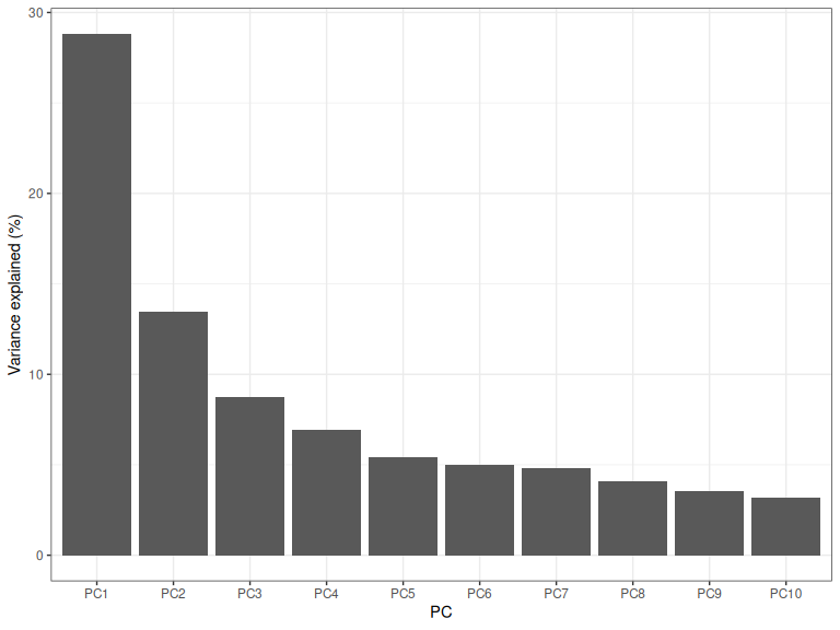
Figure 3.4: Screeplot of the percentage of variance explained by the first ten PCs.
Figure 3.4 is an example of a “screeplot”. Various methods are out there for determining how many PCs to take here. Almost all of them amount to rules of thumb, and those which are more deterministic are not necessarily appropriate. There’s no way to avoid applying judgement here!
One of the most common ways to use screeplots is to decide on an ‘elbow’ in the plot. Where does the plot cease to be steep? We could make an argument for including PC1 only, or perhaps PC1 and PC2 on this basis.
Our response to this has been to adopt permutation and bootstrapping approaches
of the sort discussed in (Vieira 2012) and implemented
also in the PCAtest package (Camargo 2022). This
gives us a way to decide how much variance we would expect to be explained by
a given PC given the absence of patterns in the data.
Our approach uses the pca_test() function in the nzilbb.vowels package. We
apply this as follows:
qb_pca_test <- pca_test(
  QB1_intercepts |> select(-Speaker),
  n = 100 # The number of permutations to try. I'd go up to 500 for anything
  # you publish, but leaving it at a lower number is better when experimenting.
)
We can then plot our variant of the screeplot with the
plot_variance_explained() function.
plot_variance_explained(qb_pca_test, pc_max = 10)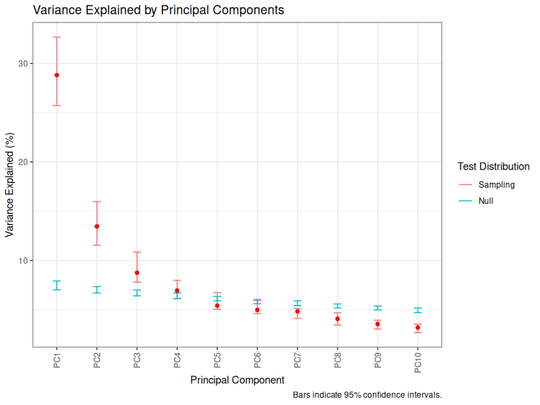
Figure 3.5: Screeplot with error bars.
Figure 3.5 introduces two changes to what we saw in Figure 3.4. First, the red bars are estimated confidence intervals for the variance explained. They are estimated by bootstrapping. That is, by repeating the analysis over and over again while excluding different portions of the data. Second, the blue bars indicate the same distribution for data in which we have randomly shuffled each column.
We argue that all PCs in which the red point appears above the blue bar should be explicitly mentioned somewhere. However, often the PCs which are very close to the blue bar are uninteresting and so can be rejected. This will usually only require a sentence or two, and might only appear in supplementary materials. We’ll see what this looks like in a moment.
The second thing to note is scenarios in which two or more red bars overlap. This happens for PC3 and PC4 in the plot above. In any situation when two PCs explain the same amount of variance, PC loadings can become unstable. We will discuss ways to deal with this later in the workshop.
3.3.2.1 More details about ‘stability’
There are actually two issues we’re dealing with when thinking about the red points and bars:
Is one PC reliably distinct from the next PC? This is true if the red point of PC\(n\) falls outside of the red bars of PC\(n+1\).
Are the confidence intervals which we put on the loadings in the next section stable? This is true if the bars of PC\(n\) do not overlap the bars for PC\(n+1\).
3.3.3 Interpreting PCs
As already noted, we interpret PCs by looking at the loadings. Just as in the
previous section, we’ll look at a standard way of looking at PC loadings and
then introduce our preferred way (which again, uses pca_test()).
With the output of prcomp(), we can use the pca_contrib_plot() function from
nzilbb.vowels. These plots were used in BRANDETAL.7
pca_contrib_plot(qb_pca, pc_no = 1, cutoff = NULL) /
  pca_contrib_plot(qb_pca, pc_no = 1, cutoff = 50)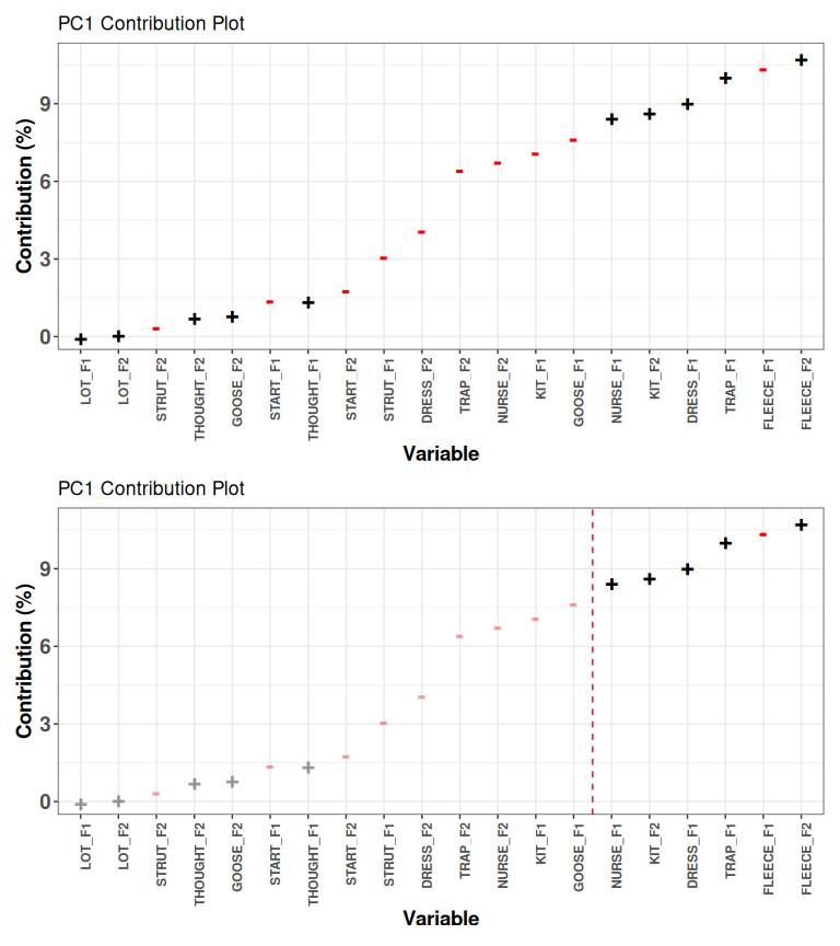
Figure 3.6: PC1 loadings with and without 50% cutoff.
Figure 3.6 shows the loadings for PC1 with and without a cutoff value at 50%. If we accept a 50% cutoff, then we only interpret the variables on the right hand side of the red line. This number should be chosen in advance. Some researchers instead use the ‘elbow rule’ again here. In which case, they would likely choose the variables from trap F2 and to the right.
Again, we are in an area where there is no one right answer. In this case, I’d argue against the 50% rule, because there is no clear rationale for drawing the line between goose F1 and nurse F1. The movement in, to repeat the same example again, kit F1, seems plausibly associated with the variables to the right of the red line.
We now prefer to use the plot_loadings() function from nzilbb.vowels, which
adds confidence bars to ‘index loadings’. Index loadings are the loadings
multiplied by the amount of variance explained by each PC. This is the approach
encouraged by Vieira (2012). It penalises loadings in
weaker PCs, which can often represent noise in the data.
plot_loadings(qb_pca_test, pc_no = 1)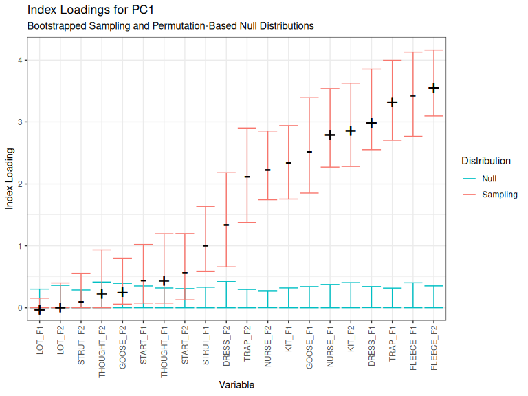
Figure 3.7: Index loadings for PC1.
When we look at Figure 3.7, we see black indications of the loading and its direction. In this case, when PC1 increases, fleece F2 increases (because its loading has a ‘plus’ sign) and fleece F1 decreases (because its loading has a ‘negative’ sign).
If an index loading appear above the blue bars, it is larger than would be expected for data with no structure. There is a clear rule for the blue bars: ignore variables whose loadings appear below the blue bars.
When we turn to the red bars, we are back into the realm of rules of thumb and judgement. The red bars then indicate 95% of the range of the index loadings for that variable in our bootstrapped samples. We treat these as indicative of how stable the covariation between variables is. If the lower limit of a red bar gets near zero, then we have reason to think the corresponding variable only happens to be correlated with the others in this dataset. When using PCA in an exploratory spirit or to generate hypotheses, any variable with a red bar starting near zero should be excluded from any claimed patterns of covariation. This is an area where we need to do more work to explore the consequences of alternative rules for including variables.8
To repeat, because this can be unclear: we take plots like Figure 3.7 to give clear advice about which variables should definitely be excluded, but no definite advice about which variables should be included.
So what does Figure 3.7 mean? We can read the relationships off the
loadings. This, as mentioned above, takes a few mental steps, especially when
moving from loading plots to the vowel space. We have started using the
plot_pc_vs() function to quickly plot loadings in the vowel space. This
takes some of the mental load off.
pc1_vs <- plot_pc_vs(
  QB1 |> relocate(Speaker, Vowel, F1_lob2, F2_lob2),
  qb_pca_test,
  pc_no = 1
)
pc1_vs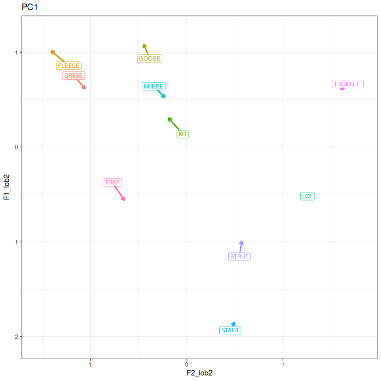
Figure 3.8: PC1 loadings represented in vowel space. As PC1 scores increase, a speakers vowels tend to move in the direction of the arrows.
The overall impression in Figure 3.8 is that higher values of PC1 lead to more canonically ‘conservative’ realisations of NZE vowels. This includes fleece, goose, nurse and other vowels not typically included in the short front vowel shift.
If you can’t see the arrows in the plot on your device, change the size of the plot. In RStudio, you can press the ‘show in new window’ button which appears at the top right of the plot in the output of a code chunck.
Sometimes, it will be easier for interpretation if the direction of a PC is
changed. In this case, we might want to have positive PC values indicate an
innovative rather than conservative speaker. The nzilbb.vowels package has
the function pc_flip() for this purpose. It works on the output of prcomp()
and of pca_test(). Let’s flip PC1 for the two PCA objects we currently have.
Now we repeat Figure 3.8, and see that the loadings have reversed.
pc1_vs <- plot_pc_vs(
  # We need the original vocalic data to find the mean values of each vowel.
  # The function assumes the data's first four columns are speaker id, vowel id,
  # F1, and F2. In this case, we want normalised values, so we use `relocate()`
  # to ensure that they are in the third and fourth column (rather than raw
  # values).
  QB1 |> relocate(Speaker, Vowel, F1_lob2, F2_lob2),
  qb_pca_test,
  pc_no = 1,
  is_sig = TRUE # This option is only available when plotting pca_test() results.
)
pc1_vs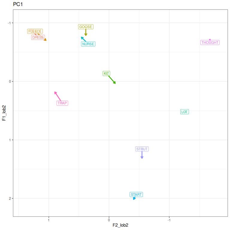
Figure 3.9: PC1 loadings represented in vowel space. As PC1 scores increase, a speakers vowels tend to move in the direction of the arrows. Flipped from previous figure.
What about PC2?
plot_loadings(qb_pca_test, pc_no = 2)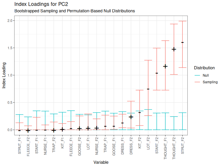
Figure 3.10: Index loadings for PC2.
Here we have four clearly covarying variables: strut, thought and start F2, and thought F1. We were very happy to see this pattern, which also appears in the ONZE corpus (Brand et al. 2021). It is open to us to include or exclude lot F2.
What does this look like in the vowel space?
pc2_vs <- plot_pc_vs(
  QB1 |> relocate(Speaker, Vowel, F1_lob2, F2_lob2),
  qb_pca_test,
  pc_no = 2,
  is_sig = TRUE
)
pc2_vs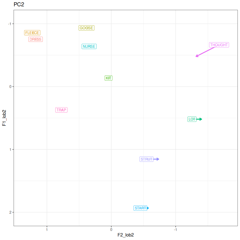
Figure 3.11: PC2 loadings represented in vowel space.
As in (Brand et al. 2021), Figure 3.11 shows a pattern where the back vowels can be more or less linear, with thought fronting while lot and strut back, or vice versa.
The feature of this PCA which most excited us was the close match between QB1 PCs and the PCs derived from ONZE. Patterns discernible over the long time depth of ONZE are also present in a much more recent data collection.
4 Final words and future directions
Some explanations of PCA within linguistics take a different tack from what we
have presented above. For instance,
Desagulier (2020) presents PCA as one amongst a
number of exploratory methods which can be used to draw conclusions ’for the
corpus only (438). Exploratory use of PCA does not provide a strong test of
the patterns which we pick out. But we can make predictions about what PCA
will show in another data set (as in Hurring et al. (Under review)). We can
also use bootstrapping methods (as in pca_test()) to help mitigate against any
idiosyncratic features of our corpus.
In future work, we’ll look at the use of bootstrapped confidence intervals and index loadings when compared with a rotation-based method. Some work towards this was presented at Methods in Dialectology last year (sheardRotatingPrincipalComponents2024?).
It is also important to note the existence of Functional Principal Component Analysis. Another stream of research at NZILBB has been working with this method recently. One possible way in is (gubianUsingFunctionalData2015?).